Why a Forties Color Refresh Is About Addition, Not About Avoiding Certain Colors
Style advice aimed at women in their forties often frames it as a list of colors to avoid, but the more useful shift isn’t about elimination at all, it’s about adjusting how much of a color appears and where it sits relative to the face.

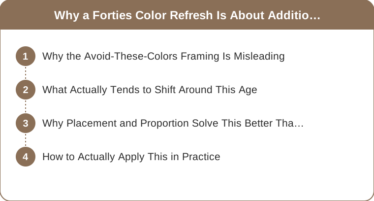
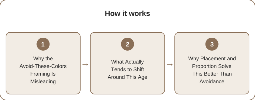
Why the Avoid-These-Colors Framing Is Misleading
The problem with the common advice: framing any color as universally off-limits after a certain age ignoring that skin tone, hair color, and personal contrast vary enormously and don’t shift the same way for everyone at forty.
What Actually Tends to Shift Around This Age
The real change: skin’s natural contrast and luminosity gradually softening for many women, which can make very saturated colors worn directly at the face specifically read differently than they used to, without meaning the color itself needs to disappear from the wardrobe.

Why Placement and Proportion Solve This Better Than Avoidance
The better strategy: moving a bold, saturated color away from directly framing the face, into a bag, shoe, or lower-body piece, keeps that color in the wardrobe while adjusting for any softened facial contrast, rather than removing it entirely.
How to Actually Apply This in Practice
The practical approach: testing a favorite bold color near the face first, and if it now reads as harsh rather than flattering, shifting it to a piece worn farther from the face rather than retiring the color altogether, and the frame (a softened facial contrast changes where a bold color works best, not whether it’s allowed — moving color placement rather than avoiding it keeps the wardrobe personal rather than following a generic age rule.)
Style advice aimed at women in their forties often frames it as a list of colors to avoid, but framing any color as universally off-limits after a certain age ignores that skin tone, hair color, and personal contrast vary enormously and don’t shift the same way for everyone, while what actually tends to shift is skin’s natural contrast and luminosity gradually softening, which can make very saturated colors worn directly at the face read differently without meaning the color itself needs to disappear from the wardrobe. Moving a bold, saturated color away from directly framing the face, into a bag, shoe, or lower-body piece, keeps that color in the wardrobe while adjusting for any softened facial contrast, so testing a favorite bold color near the face first, and shifting it to a piece worn farther away if it now reads as harsh, keeps the wardrobe personal rather than following a generic age-based rule.
Keep Reading
This article is for general styling and informational purposes only. Trends, sizing, availability and pricing may vary by brand and season.